It’s Monday morning. It’s probably raining out, the radio was mostly just annoying, rambling DJs, your coffee tastes kind of burnt; all probable “welcome backs” after a weekend off. Imagine making this return to a drab, grey office with your tan-colored cubicle and neutral-accented everything. It’s not very cohesive to legitimate productivity once you make it into work.
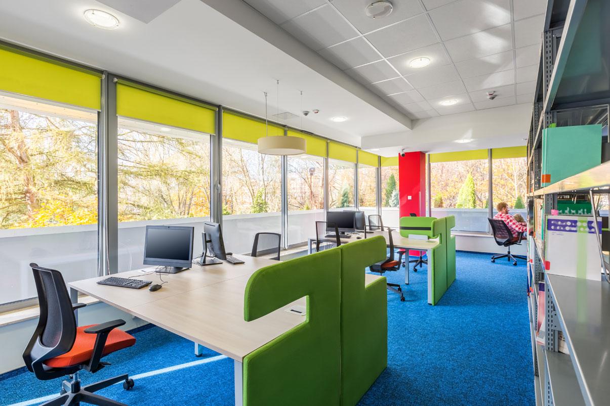
Now, imagine walking through the doors and entering a modern, open office with vibrant green walls, sleek metallic desks, lower-to-the ground desk walls, and a foosball table surrounded by engaged and jovial coworkers.
If the latter sounds like a better deal, it’s because surrounding yourself with shades of green can help alleviate anxiety and lower-to-the ground cubicles help relieve feelings of being “trapped” at work. Such simple changes seem to be a no-brainer if you have your employees’ best interests in mind. Yet, you’d be surprised how many employers don’t take advantage of the effects that colors and simple interior design details can have on productivity and overall morale.
The Psychology of Color
Before you pick out a new interior design scheme, it’s important to know how colors affect us. Different hues and shades ignite different feelings — some good and some bad. It’s all about finding a balance between the restful influences of cool colors with the stimulating effects of warm ones. For example, a potential downfall of the workplace described above: the green will calm employees, however, too much green (and other cool colors) incorporated everywhere without warm colors to break it up could make one TOO calm and borderline sleepy.
The psychology of color has been discussed in psychological publications, and there have been numerous studies on the topic; it’s nothing to turn your head away from. So, see how each color can affect one’s feelings and mood and learn how to find a balance to maximize your employees’ productivity in the workplace.
Top 5 Colors to Boost Productivity in the Workplace
While all colors have their potential positive and negative effects, the combination of the following colors throughout the office provides a great equilibrium to the ambiance — as long as they’re used correctly.
Green
As mentioned earlier, green helps one feel tranquil, relaxed and rejuvenated. It works well all around the office, specifically where you’re trying to keep everyone in a calm mood. From conference rooms, to open work spaces, to the waiting area — incorporating different shades of green throughout the office will spread the calming nature. And who doesn’t love a calmer, more relaxed office? One way to incorporate more green is simply by adding plants to the workplace.
Blue
Since it’s another cool color, blue helps soothe one’s mood — however, it is from a more intellectual perspective. When there are shades of blue incorporated in the interior environment, it promotes deeper thinking and can help bring on more inspiration. If there is a creative department in your company, different shades of blue are often used in their space to help them access their creativity and flourish.
Blue also works well on the walls of conference rooms or spaces where many meetings occur because it can help with productivity; just try to balance with brown and black conference room furniture to not overdo the blue.
Just keep this color away from your kitchen/dining area because it has also been shown to decrease appetite.
Red
Red is shown to help increase energy and create a sense of urgency. It’s because of this that purple — the combination of red and blue — is used in spaces where workers need to be creative. It provides the creativity boost from cool-blue with the lift in energy from warm-red.
This warm color directs one’s attention to specific locations, making it perfect for accents. Spreading shades of red around the office can help divert attention to where you desire and also should be used more freely (with accessories and art) in spaces where some extra motivation wouldn’t hurt. Even something as simple as a small red chair can help liven a space up.
Red also is shown to improve appetites, so it is often used in dining areas.
Yellow
They call it a “sunny disposition” because it’s yellow. This color is most commonly associated with optimism, self-assurance, and happiness. However, too much yellow can bring those feelings of elevation too far and cross into anxiety (or even anger). This can happen with too many warm colors, which is why they’re often used more subtly than as the main focus in the design of a room. It works best in places such as hallways, waiting areas or lounge areas to help limit the doses of glee.
White
White is the ultimate of the accent colors because it helps make a space feel bigger, cleaner and generally it helps people feel cheerful. Hallways, small rooms and other areas you want to maximize space are the best places to make white the primary focus. White coordinates well with all of the other colors so it can be used as a base, accent or equal counterpart to another color in any room really. It can be the foundation for the warm color accents in the dining space or the color of the tables and chairs in the blue conference room.
Bonus: White also symbolizes cleanliness, so, when used, it helps make the room feel cleaner with this great base color.
The essential thing to remember is that it’s all about balance and using the right color schemes in the right areas. Experiment with different color combinations and even change it up every month to A/B test how it affected your company productivity month over month. The options are endless!

