A paper’s brightness is scientifically measured in terms of how much blue light is reflected from it. It doesn’t necessarily mean how white (or yellow or pink) your paper is, but rather how much blue light it reflects on a wavelength. (Blue light has a wavelength of 457 nanometers and a wave width of 44 nanometers, in case you were wondering.)
Paper brightness is measured on a scale of 0 to 100. This scale determines how much light is reflected from the surface of a sheet of paper. The higher the number, the brighter the paper. For example, paper with 98 brightness is slightly brighter than paper with 97 brightness.

How to choose the right brightness for your documents:
When Paper Brightness Matters
Depending on the print project, you may want to opt for brighter paper or slightly dimmer paper.
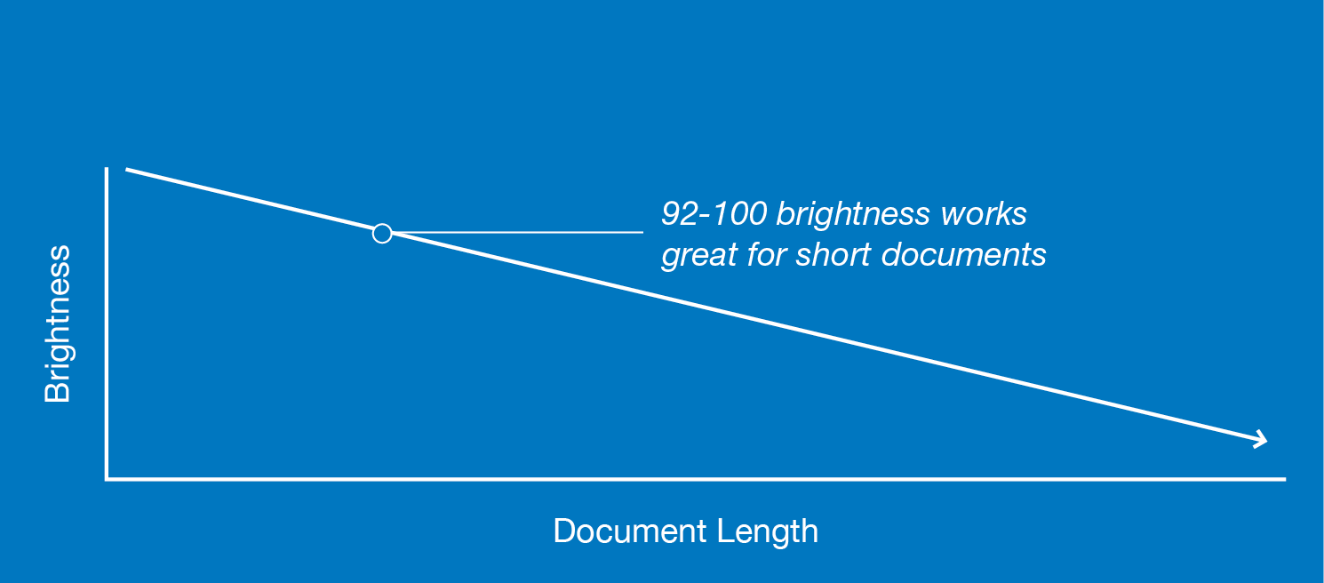
- Short and sweet? Go bright: Choose brighter paper for short documents and bulletins. Brighter paper offers a stronger contrast with black ink, making your brief message easier to read with maximum impact. To offer a stronger contrast between black ink and your paper, opt for a bright white paper with a range of 92 to 100 brightness.
- Warm Tones, Bright Paper: If you’re printing a document with visuals or logos that incorporate warmer tones printed on the page (red, yellow, or orange), opt for brighter paper. The balance of blue light reflected from the page will make those warmer colors pop. Once again, paper with a brightness level of 92 to 100 is ideal for balancing this contrast.
- Longer Message? Make It Easy On the Eyes: Longer documents such as an eBook or a lengthy training manual that need to be read and digested over an extended period of time may call for paper that is less bright (92 to 96 level brightness, if you’re opting for the more standard levels of paper brightness). If someone will be reading your printable document over a longer span of time, paper that reflects less blue light may produce less strain on the readers’ eyes.